It’s 2 AM, and your customer’s basement is rapidly flooding. They’re frantically searching for an emergency plumber on their phone, clicking through multiple websites that don’t load, are difficult to navigate, and promise “quality service” but offer no clear way to get immediate help.
This scenario plays out thousands of times daily, yet most home service websites fail to convert these desperate searches into actual leads.
Your website’s aesthetic appeal matters far less than the invisible barriers frustrating potential customers at every turn—and today, I’ll teach you exactly how to eliminate them.
The Hidden Cost of Poor User Experience
The harsh truth about your home service website is that you’re losing valuable leads in the first few seconds—before potential customers even see your services.
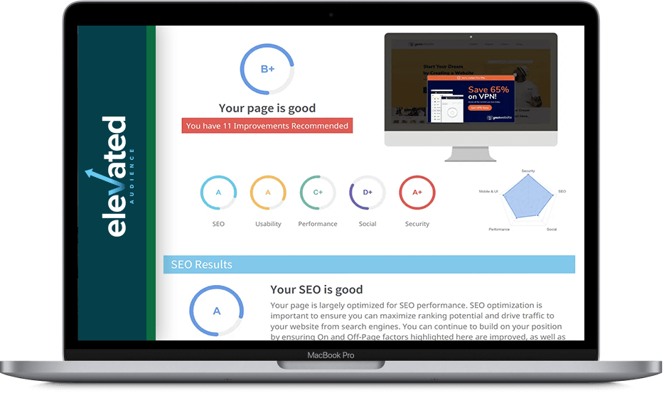
Our extensive analysis of home service websites reveals that these crucial initial moments determine whether you capture a lead or watch them click away from your competitor.
Speed Kills Conversions
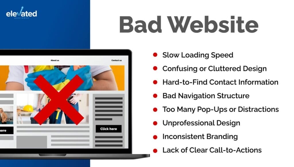
Modern consumers demand instant gratification, albeit most home service websites load quite slowly. When your site loads slowly on mobile devices, you’re not just testing patience—you’re actively driving away potential customers.
According to a study in 2024, 40% of visitors will leave your website if it takes longer than three seconds to load.
In my experience working with home service businesses, slow loading times consistently emerge as one of the primary reasons visitors abandon websites before converting.
Navigation Nightmares Cost You Money
Your website’s complex navigation structure is like a maze where the exit signs lead nowhere.
When potential customers need emergency plumbing or HVAC services, they’re not interested in solving puzzles.
The most successful home service websites we’ve analyzed maintain ruthlessly simple navigation structures that prioritize immediate access to core services.
Dead-End Buttons Are Deal-Breakers
Nothing screams unprofessionalism louder than non-functional contact elements on your website.
Imagine a homeowner, ankle-deep in water at 2 AM, frantically clicking your “Emergency Service” button—and nothing happens. You’ve not only lost a lead but also created a negative brand impression that’s nearly impossible to reverse.
These technical oversights directly impact your bottom line.
Vague Service Areas Create Uncertainty
Hiding or burying your service area information is equivalent to throwing away leads. When potential customers can’t quickly confirm whether you service their location, they move on—instantly. Clear, prominent service area information builds immediate trust with your audience.
The solution to these costly mistakes is understanding that every moment of friction in your user’s experience is actively costing you money.

The Trust Gap: Why Visitors Hesitate to Contact You
When your potential customers land on your website, they’re not just looking for services—they’re looking for reassurance.
Most home service websites miss critical trust signals that customers subconsciously seek. Professional licenses and insurance information shouldn’t be buried in the fine print—they’re your badges of credibility. Yet many websites treat these crucial elements as afterthoughts, forcing potential customers to hunt for verification of basic qualifications.

Social proof is one of the Infinity Stones against uncertainty.
Your satisfied customers are telling compelling stories about your service, but where are these stories on your website?
Strategically placing authentic reviews and detailed case studies shows prospects that others have already taken the leap of trust and been rewarded for it.
Showcase Yourself and Your Team
Your team photos and company story aren’t mere decorative elements—they’re trust builders that humanize your brand.
Faceless businesses trigger skepticism. Show the real people behind your service, share your company’s journey, and transform anonymous visitors into confident leads.
The uncertainty gap created by missing trust elements forces potential customers to make assumptions—and assumptions rarely favor conversion.
Every missing trust signal adds another layer of hesitation, pushing prospects closer to the back button and toward your competitors who understand the psychology of trust-based conversion.
The Message Mismatch
Your messaging strategy shapes conversion success more than any other website element. Yet most home service businesses sabotage their conversion rates with generic messaging that creates cognitive dissonance between customer needs and service presentation.
The Fatal Flaw of Generic Messaging
You wouldn’t tell someone with a flooded basement about your “commitment to excellence.”
Yet that’s exactly what most home service websites do.
Generic messages about quality service are like using a bucket to fix a burst pipe—technically correct, but they miss the point entirely.
The Psychology of Pain Point Messaging
Expert conversion optimization leverages psychological triggers by aligning website copy with customer pain points.
This isn’t merely about listing services—it’s about demonstrating a deep understanding of customer urgency and emotional states.
The highest-converting clients structure their messaging around immediate problem resolution rather than service features.
The Cognitive Friction Factor
Every second a customer spends translating your generic service descriptions into their specific emergency is a second too long.
It’s like giving someone a manual when their house is on fire.
I’ve seen the highest-performing websites address urgent needs directly: “Emergency Plumbing—At Your Door in 60 Minutes or Less.”
Converting Copy in Action
Consider two approaches to emergency plumbing services:
- Ineffective: “We provide comprehensive plumbing solutions using state-of-the-art equipment and highly trained technicians.”
That’s like telling someone their house is on fire and responding with your company’s mission statement.
- Effective: “Facing a plumbing emergency? Our rapid response team arrives within 60 minutes, stops water damage immediately, and handles insurance documentation. Over 1,000 water emergencies resolved this year.”
The difference?
The second approach eliminates cognitive friction by directly addressing customer urgency while demonstrating expertise through specific, action-oriented messaging. I’ve tested both approaches, and the difference in conversion rates for the latter is much better.
When emergency strikes, customers choose action over credentials every time.
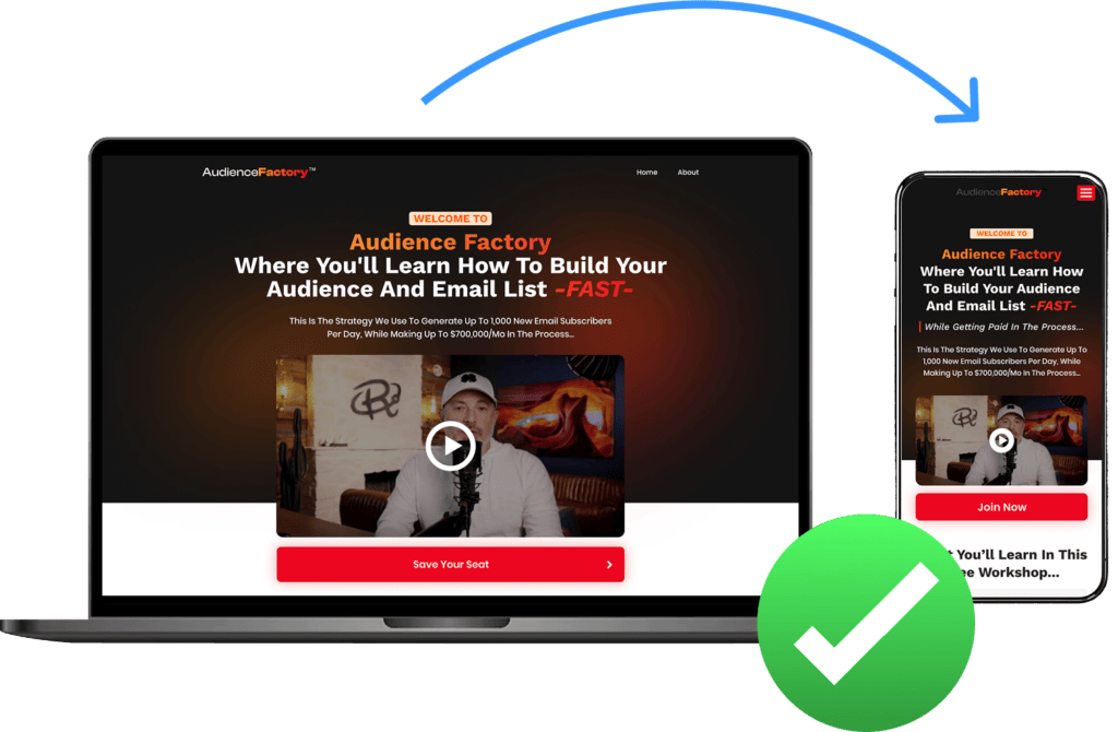
The Mobile Experience Breakdown
An easy mobile experience is the crux of conversion success in the home services industry.
When plumbing leaks or AC units fail, customers always reach for their phones first.
A suboptimal mobile experience doesn’t just frustrate users—it decimates your conversion potential and search visibility. Take it from me as a homeowner—I’ve needed home services many times, and if I click on your website and the user experience is terrible, I’m clicking off.
Critical Mobile Friction Points
Mobile interfaces demand precision.
Oversized elements waste precious screen space, while undersized tap targets force users to zoom and struggle.
Contact forms designed for desktops create particular friction—tiny checkboxes and dropdown menus become conversion killers on mobile devices.
Contact information must be immediately accessible via prominent tap-to-call buttons and persistently visible and clickable phone numbers.
Yet many home service websites bury this critical information in hamburger menus or footer sections, creating unnecessary barriers during emergency situations.
Responsive Design Failures
True mobile optimization goes beyond just shrinking your desktop site.
Your website needs to be like a skilled plumber—adapting perfectly to any situation.
I constantly see crucial content vanishing on mobile like socks in a dryer, menus that make no sense, and forms that break faster than a cheap pipe fitting.
Image optimization remains a persistent challenge. High-resolution photos are meant to showcase your work instead of creating loading bottlenecks on mobile networks. This technical oversight directly impacts both user experience and search performance.
The SEO Impact
Google’s mobile-first indexing means your mobile experience directly influences search visibility.
Poor mobile usability signals affect local pack rankings—critical for home service visibility. Google specifically evaluates mobile page speed, interactivity, and visual stability through Core Web Vitals, making mobile optimization a primary driver of search success.
Converting mobile traffic requires a fundamentally different approach than desktop. Every tap should advance users toward conversion, every screen should prioritize immediate action, and every element should optimize for mobile-first engagement.
The Solution Framework
Website optimization requires a systematic approach to eliminate friction and maximize conversions.
Critical Friction Point Resolution
Start with high-impact, low-effort optimizations. Implement aggressive image compression and caching strategies to achieve sub-second load times.
Streamline navigation by removing unnecessary menu layers and making sure every service page is accessible within two clicks.
Install persistent contact buttons that remain visible during scrolling, and implement smart forms that adapt to user context.
Engineering the Friction-Free Funnel
Modern conversion funnels must anticipate and remove obstacles before users encounter them. Each page should present a clear, logical next step.
Implement smart CTAs that evolve based on user behavior.
Replace generic contact forms with contextual conversion points that acknowledge the user’s current position in their decision journey.
Strategic Trust Integration
I’ve found trust signals work best at decision points, like showing licenses during estimate requests or reviews near pricing.
It’s about anticipating customer concerns before they arise. Your credentials should be as visible as your service truck’s logo.
Mobile-First Architecture
Design for thumbs first, desktop mice second. Make buttons tap-friendly (44×44 pixels minimum), keep vital info within reach, and ensure your contact options stay visible without scrolling.
Think of mobile users as emergency callers—they need quick, frustration-free access.
Conversion Rate Optimization
Track user behavior like a diagnostic system. Monitor scroll patterns, form interactions, and abandonment points.
Use heat mapping to spot friction, then A/B test solutions. Every improvement should increase conversions like a well-tuned service process.
Mastering the Conversion Game
Your home service website’s conversion success hinges on eliminating friction at every touchpoint. By implementing our solution framework, you’ll transform your website from a passive brochure into a conversion-optimized lead generation engine.
Now is the time to conduct a thorough friction audit of your website and systematically address the barriers preventing qualified leads from becoming loyal customers.